MENUMENU
 Ready, Set, Go…Mobile!
Mobile websites present a huge opportunity to target the right clients from your mobile device. Join the revolution and get mobile! Be a statistic…Over 75% of internet users in the United States go online via their mobile devices.
360 WEB DESIGNS creates flexible websites that work well with today’s demanding mobile device users. Your website can be viewed from a computer, tablet, or a mobile device, and our team will get you mobile by building a website that can be seen worldwide in just seconds.
Mobile friendly sites are ranked and shown at the top of search engines and are the first to be seen by potential clients. We will create your website to be responsive on smart phones and tablets, and deliver a great experience, helping to present your business the way it’s meant to be seen…clean, quick-loading, and easy-to-read.
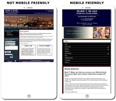
Having a mobile friendly website means your website automatically changes its display to fit nicely on the screen of a mobile device. Desktop versions appear differently than mobile versions when viewed on a smart phone or tablet. If your website looks the same on both, than it is not mobile friendly. Both people and search engines will be will turned away from your website! 360 WEB DESIGNS takes pride in our ability to create versatile, responsive websites.
We can easily convert your existing website to be mobile friendly. This means it will show up in a responsive way that is easy to navigate when viewed on smartphones, tablets, and other mobile devices. We create your website to be responsive on smart phones, and deliver a rich experience, helping present your business the way it’s meant to be seen: clean, quick loading, and easy-to-read.


Copyright © 2004 - 2022 360 WEB DESIGNS | Dublin, CA 94568 | 925-989-7737